Friday, 30 March 2012

Evaluation Question 1

In what ways does your media product use, develop and challenge forms and conventions of real media products?


Prezi explaining horror conventions in trailers and how we used them:
PREZIShow All

Specific examples of shots used in our trailer which take influence from real horror films:


Monday, 26 March 2012

Final Evaluation Question 3.


We used google docs, to embed this into our blog because its neater and more efficient than screen grabbing.

Final Evaluation Question 4


This is the finished evaluation question 4. We made a mini clip showing how we used new media technologies throughout our project.

Monday, 5 March 2012

DRAFT Evaluation Question 4

Here we are creating a mini video clip to show how we used new media technology throughout our project.

DRAFT Evaluation Question 2 - How effective is the combination of your main product and ancillary texts?


This was the beginning stage of our evaluation for Question 4. We began to research all our methods and highlight which ancillary text features have used synergy and related advertising and marketing techniques. We intend to progress into a comparative study between our photographs, choice of imagery and existing media texts.

Comments and Feedback from Social Networking


These comments were important parts of our feedback and audience responses. They help us to acknowledge what can be improved and how our trailer is effective in its appeal and structure. The narrative within the trailer needs to be represented in a way that defines the genre and incorporates the conventions that appeal to our target peers. Ultimately, feedback from numerous sources help us to define what makes our trailer good and what could be achieved to make it even better.

Monday, 27 February 2012

Starting Evaluation Q1


Today we started the first evaluation question using prezi.com.

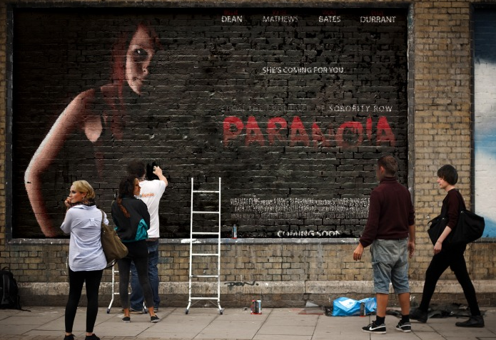
www.photofunia.com - Marketing and Audience Appeal


We discovered this site called Photofunia which really appealed to our creative development. The visual ancillary texts are just as important as the final trailer in terms of marketing and exhibiting the film. Common uses of advertising are billboards and cinema placks, bus shelters, buses etc. These larger than life examples are a way for us to promote and visualize our work in real situations and locations. It is a positive step forward for us, especially when using different programs and websites to experiment with promoting our film and trailer.

Multimedia Marketing

Hosted by Galleries.cetrine.netHosted by Galleries.cetrine.net


Click on these thumbnail images to get a direct link to a live interactive version!

Monday, 20 February 2012

FINAL Theatrical Main Poster

This image is the original from a set that we shot especially for this project. We used Adobe Photoshop to visually enhance the colour and also help evoke the mood and feeling. The use of lighting was significant as it helps to portray an atmospheric deadly impression. This all encourages and entices the audience and helps set the mood for the film. The next step was to use typical conventions and features of a theatrical film poster and apply it to this image! Our initial thoughts were to flip the image so that the content detail was presented on the right hand side.


We studied current and existing media texts and posters to create this layout. Our main influence was the Inception poster that we used to analyse previously. The layout and style of the imagery gave it impact and provided a good starting point to work with. We decided to keep the text simple, however the brand recognition came from the font style used for the film title. The 'Face your Fears' font style was indicative of each piece we have produced in association with our film and trailer. It is important to keep the text recognisable and relatable as it helps when encouraging and developing a large audience base. The logo's used for the base of the poster were also important to include as it makes it appear more professional and highlights other production companies. Colour was also very important as it needed to be subtle yet effective. The aesthetics of the finished piece had to work together and create a consistency throughout. The gradient of the production detail text also adds to the feel of the poster as it fades into the 'COMING SOON' text feature. The most important inclusion to the poster was the tag line. The 'She's coming for you' tag is personal to the film and acknowledges the links between all the aspects of the film.

Monday, 6 February 2012

Trailer Feedback

This is one of the feedback forms we received from a focus group of our intended target audience. It has a number of positive points as well as some things we could work on. These feedback forms will help us to make our trailer more professional and attract our target audience.


Some things we could improve on would be; tighter editing and the colour of the text needs to be all the same.


Some of the positive things said were; they liked the variety of shot used, they liked how it gave away little information and kept you hooked.


This helped us get an understanding of how our trailer comes across to our target audience, and helps us know if the trailer works as a whole or not.

Our Trailer


We have finished our trailer for Paranoia. Using iMovie we cut our footage together in a way that provokes an audience reaction.


The look of our trailer is mysterious to comply with the slasher horror genre. Using a pre-loaded effect "Bleach Bypass" on most of the cuts, has made the trailer aesthetically gloomy and dark. Many of the scenes have been sped up or slowed down to match the soundtracks elevating climax.


The music (from freeplaymusic.com) "The Tomb" builds the audience's tension up and up until finally it is released with a loud climax accompanied with the appropriate "action" shots.

Monday, 30 January 2012

Landscape Poster Layout Examples

As our first poster was portrait, we thought we'd try and do a landscape poster to make it look different.


The inception poster to the left was our inspiration, we like how all the text is down one side, leaving the image to have a side to its own making the image more prominent.


The 'Let me In' poster is effective also as the text is in the middle separates the two images, it also makes the text really stand out, due to the red behind the white text. The connotations from the deliberate choice of colour and use of the red provides an insight into the conventions and style of the horror. The 3 tag lines are used in a repetitive manner. The use of this language feature adds impact to the genre and also makes the audience believe whats being said. It works psychologically to emphasize the message.  

Advertising


This is another website we have used to market our posters. It shows different ways to advertise our movie which i think works really well.


Its very simple and you just have to upload your picture onto the website and it'll import onto the picture similar to CBS outdoor we used, but this website just does still images.


This is our poster which we placed on a billboard, which is similar to the bus one we used on CBS outdoor.
We thought placing the poster on a huge billboard in what looks like a busy city looks really effective.


The picture shown below is from the same website, we decided to use our 3D poster on an Iphone, making it seem a bit like an Iphone app. It shows a different style of marketing and also shows how you can use different technologies to advertise our poster.


Monday, 23 January 2012

Production Logo


This is our logo that we created to acknowledge our production company. It needed to be simple but conventional as it had to feature on the poster and additional ancillary texts. The font was creepy but also readable and the red 'P' on each title was a deliberate choice as it defines the genre and the company together. This logo was an exciting move forward for us as it made us feel like an established company. 

Magazine analysis

The masthead in this magazine is strong and bold, which we used for inspiration for our own magazine cover. The strapline is enticing and intriguing to draw the readers in. The placement of the cover lines slanting towards the middle and the main cover line is very clever and interesting as it reflects the actual Inception DVD cover and promotes the movie. The background also looks like a maze but at a closer look it’s a bird eye view of buildings and a city, which is a key theme of the movie. I think it’s a very stylish way of presenting the front cover of a movie magazine and think it really works. The colour scheme also reflects the Inception franchise, as the posters and DVD covers have the same colour scheme of red, black and grey. The use of red for the main cover line and the masthead draws attention to these spots as they are very striking which allows the reader to have their attention focused on the main article of the magazine. It will also stand out on the shelf next to other magazine of this genre.


The use of movie names in the cover lines also draws the reader in as it grabs their focus and alerts their interests to certain films or genres allowing them to want to read more. There is a wide variety of movies used in the cover lines such as Toy Story 3 and Predators, movies aimed at very different audiences attracting a wide target audience. The target audience for this magazine would be male, film lovers 16 – 25 although this issue has Leonardo DiCarprio as the main star, which could be very popular with the women who find him attractive. The confident, dangerous stance he is stood in also gives the cover a sense of quiet arrogance, alerting the reader. As well as how he is stood in the middle of the page with the text surrounding him. The black suit he is wearing also gives him a business like feel and makes him seem important clueing in the reader that he is a main character and an important part of the film. The gun he is holding also gives a dangerous feel to the cover and gives an idea of the genre of the film.

3D Poster Final

Check this out with some 3D glasses!


We've chosen to construct a 3D version of our poster for audience appeal and marketing. This poster is significant to modern media and the progression of media technologies as it is an alternative viewing experience. 

Final Finished Magazine Cover